
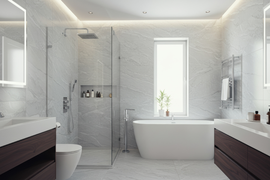
White walls are one of the most popular choices in modern Australian homes, particularly in bathrooms. Clean, timeless and versatile, they create the perfect foundation for a fresh, functional space. But when it comes to selecting blinds, many homeowners undertaking Gold Coast bathroom renovations ask the same question: what colour actually works best?
The short answer is that white pairs well with almost any colour. The smarter answer is that the right blinds depend on your overall design vision, natural light, privacy needs and the style of your renovation.
At Armrock Constructions, a trusted bathroom renovation company Gold Coast homeowners rely on, we guide clients through these decisions every day as part of a complete, well-planned renovation.
Why White Walls Work So Well in Bathroom Renovations
White remains a dominant feature in bathroom renovation Gold Coast projects for several reasons.
Timeless and adaptable
Unlike bold colours or heavy patterns, white doesn’t quickly date. This makes it ideal for homeowners wanting affordable bathroom renovations Gold Coast families can enjoy for years without needing constant updates.
Enhances light and space
White reflects natural light, helping bathrooms feel larger and brighter. This is especially valuable when exploring small bathroom renovation ideas Gold Coast properties often require, where maximising visual space is essential. From coastal homes in Mermaid Beach to apartments in Southport, light-enhancing techniques remain a priority.
Supports cohesive design
Whether you’re investing in luxury bathroom renovations Gold Coast homes deserve or refreshing an older space, white walls allow flexibility when selecting tiles, vanities, fixtures and blinds.
How to Choose the Right Blinds for White Bathroom Walls
While white offers freedom, too many options can become overwhelming. The key is to assess the entire room before making a decision.
Consider the tone of your white
Is it warm, cool or neutral? Gloss or matte? The undertone of your white walls should influence whether you select warm beige blinds, soft greys or deeper charcoals.
Look at the complete renovation design
In a professionally managed bathroom remodel Gold Coast homeowners invest in, every element works together. Your blinds should complement your tiles, cabinetry and tapware — not compete with them.
This is particularly important in custom bathroom design Gold Coast projects where finishes are carefully curated for a cohesive result.
Balance natural light and privacy
Blinds serve a functional purpose. In bathrooms, privacy is essential, but so is natural light. Depending on window placement, you may need blockout, light-filtering or screen fabrics. For particularly narrow bathroom windows, roller blinds can offer practical advantages. Selecting the right fabric first often simplifies colour decisions.
Using Contrast to Guide Your Choice
Contrast is one of the most effective tools in bathroom design.
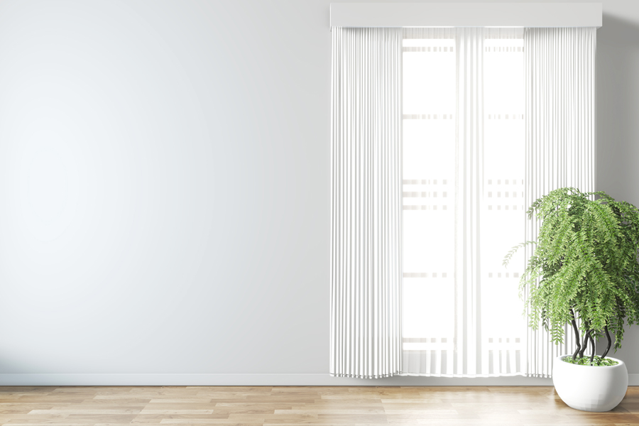
Low contrast: clean and timeless
White or off-white blinds against white walls create a seamless, minimalist aesthetic. This approach works exceptionally well in modern coastal homes and in affordable bathroom renovations Gold Coast homeowners want to keep fresh and adaptable.
Low contrast options include soft whites, light greys, creams and subtle neutrals. These choices allow other features — such as professional bathroom tiling Gold Coast specialists install — to take centre stage.
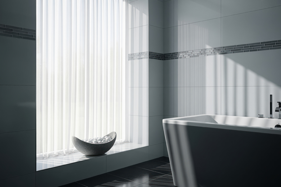
Mid contrast: balanced and refined
Mid-tone blinds such as muted greens, soft blues, warm timber finishes or medium greys introduce visual depth without overwhelming the room. Properties in Broadbeach and Burleigh Heads often benefit from this balanced approach. Grey blinds paired with white walls offer a particularly refined, contemporary look.
This option works beautifully in all-trades bathroom renovation Gold Coast projects where flooring, cabinetry and fixtures are carefully coordinated.
Mid contrast can anchor the space and connect blinds to vanity finishes or feature tiles. When considering whether blinds should be lighter or darker than walls, mid-tone options provide flexibility for both approaches.
High contrast: bold and sophisticated
Dark blinds, such as charcoal or black, create a strong visual statement against white walls. When executed thoughtfully in luxury bathroom renovations Gold Coast homes demand, high contrast can feel elegant and contemporary.
This approach requires careful planning to ensure the overall design remains cohesive.
Texture and Fabric Matter Just as Much as Colour
While colour often receives the most attention, texture and material selection play an equally important role.
Screen fabrics allow filtered light while maintaining privacy — ideal for bright coastal homes. Light-filtering fabrics soften natural light and create a calm atmosphere. Blockout blinds provide maximum privacy, especially in bathrooms facing neighbouring properties.
As a leading bathroom renovation company Gold Coast homeowners trust, we often recommend dual-blind systems for flexibility and long-term practicality.
Aligning Blinds With Your Renovation Goals
Blinds should enhance both the appearance and functionality of your bathroom.
Maximising natural light can make smaller bathrooms feel expansive. Lighter tones and subtle textures support this goal. When combined with thoughtful LED lighting options, the right blinds can transform how a space feels throughout the day.
Creating space is often a priority when exploring small bathroom renovation ideas Gold Coast clients bring to us. Light-filtering blinds and soft neutrals can visually open the room.
Defining mood is equally important. Soft neutrals promote calm. Timber tones add warmth. Darker shades introduce depth and sophistication.
Making the Right Decision for Your Bathroom
The best blinds for white walls depend on several factors:
Longevity – Will your choice remain stylish over time?
Integration – Do the blinds complement your tiles, vanity and finishes?
Function – Do they meet your privacy and light-control needs?
Personality – Do they reflect your style without overpowering the design?
At Armrock Constructions, we approach every Gold Coast bathroom renovation with a holistic mindset. With over 450 completed projects across Robina, Reedy Creek and surrounding areas, our team delivers custom bathroom design Gold Coast homeowners can trust — combining expert craftsmanship, professional bathroom tiling Gold Coast standards and seamless all-trades bathroom renovation Gold Coast management.
Whether you’re planning a bathroom remodel Gold Coast property owners can enjoy for years to come or considering affordable bathroom renovations Gold Coast families need, we ensure every detail — right down to your window treatments — supports a cohesive, high-quality result.