When planning a renovation, details matter. From tile selection to tapware finishes, every choice contributes to the final look. One question we’re often asked during Gold Coast bathroom renovations is whether blinds should be lighter or darker than the walls.
The answer isn’t a simple yes or no. The right choice depends on space, light, function, and the overall design intent of your renovation. Below, we break down the key considerations to help you make a confident, long-lasting decision—whether you’re updating a bathroom, ensuite, or full bathroom remodel on the Gold Coast.
Blinds the Same Colour as the Walls
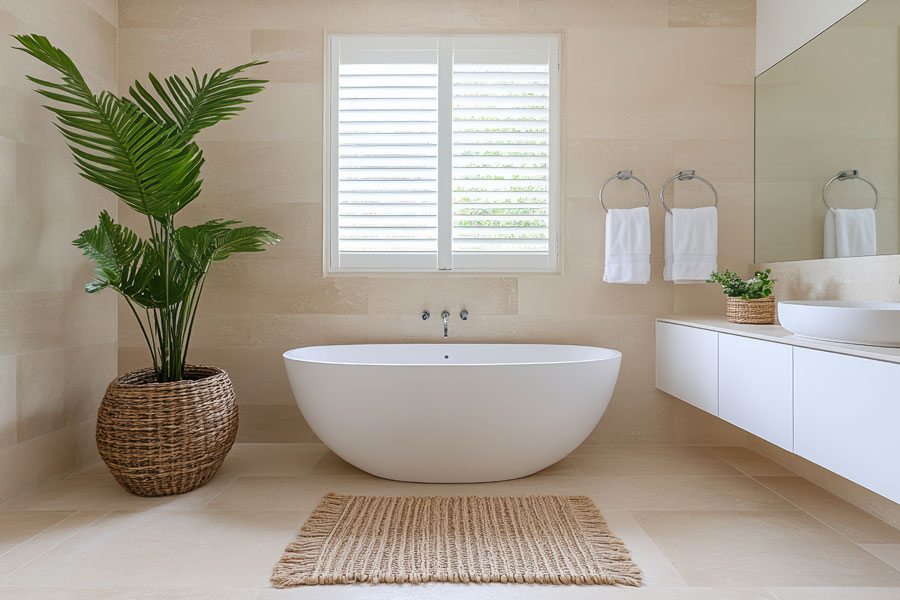
Choosing blinds that closely match your wall colour creates a seamless, cohesive look. This approach minimises visual interruption and allows other design features—such as vanities, tiles, mirrors, or feature lighting—to take centre stage.
This works particularly well in bathroom renovations where a calm, uncluttered aesthetic is the goal, such as compact ensuites or apartments. It’s a timeless solution that supports resale value and gives flexibility to update accessories over time. For inspiration on pairing blinds with different wall colours, check our guide on what colour blinds go with white walls.

Blinds Lighter Than the Walls
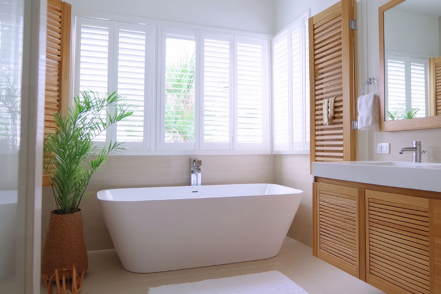
Lighter blinds introduce contrast while keeping the space bright and open. In bathrooms with limited natural light, this can significantly enhance the sense of space and freshness.
This approach is popular in smaller bathrooms or homes aiming for a relaxed coastal look—something we often see in top bathroom renovations on the Gold Coast. Light-toned blinds can also visually connect indoor spaces with the outdoors, reinforcing the airy, light-filled style that many Gold Coast homeowners love.
Blinds Darker Than the Walls

Darker blinds create a stronger visual statement and clearly define window openings, turning them into deliberate design elements.
In modern bathroom renovations, darker blinds pair well with bold tile choices, glossy finishes, or black-framed shower screens. When used thoughtfully, they help anchor the room and provide structure—an approach that works particularly well in larger bathrooms and family homes.
Considering the Blind-to-Wall Ratio
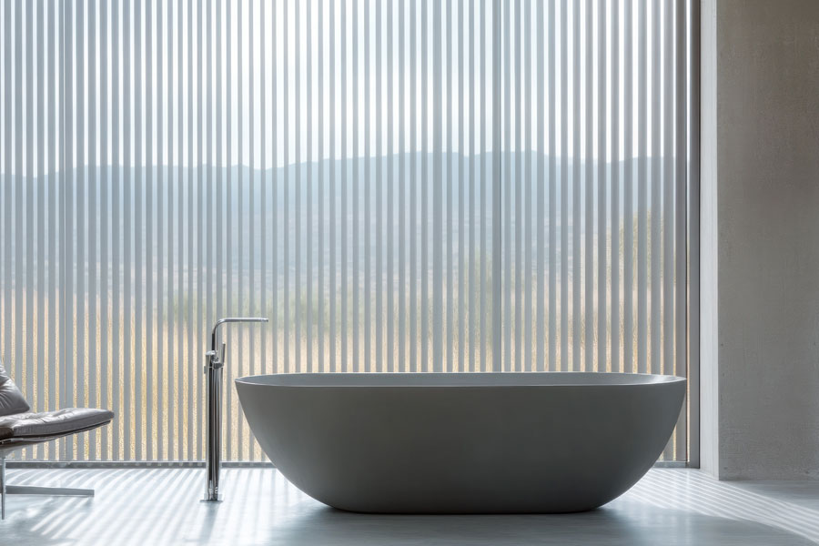
The proportion of blinds to wall space plays a major role in how light or dark they should be. Large roller blinds or full-height window coverings can effectively act as a feature wall, especially in bathrooms with expansive glazing.
If you’re unsure whether roller blinds suit narrow windows in your space, we’ve covered the options in are roller blinds the best option for narrow windows?. Screen fabrics that allow filtered daylight can appear lighter during the day, enhancing the sense of space and reinforcing the indoor–outdoor lifestyle many Gold Coast homeowners value.

Don’t Forget Window Frames
Frames influence how blinds and walls interact. Just as a picture frame affects artwork, window frames affect the balance between blinds and surrounding finishes. White frames against darker walls can soften transitions, while darker blinds paired with lighter frames can strengthen contrast. Existing frames should always be considered during the design phase of a renovation to avoid visual imbalance or dated results.
Summary: What’s the Best Choice?
There’s no one-size-fits-all answer. Both lighter and darker blinds can work beautifully when selected with intent and aligned with the overall renovation design. The key is longevity—choosing a solution that complements your bathroom layout, materials, and lifestyle for years to come.
